Design Challenge
How might we help university students find available and accessible study spaces in their neighbourhood based on their needs and preferences?
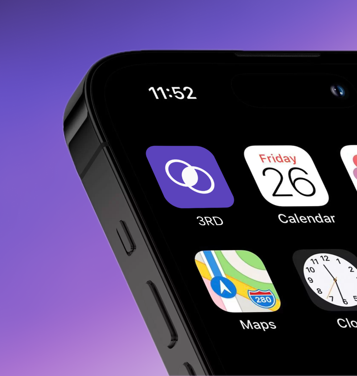
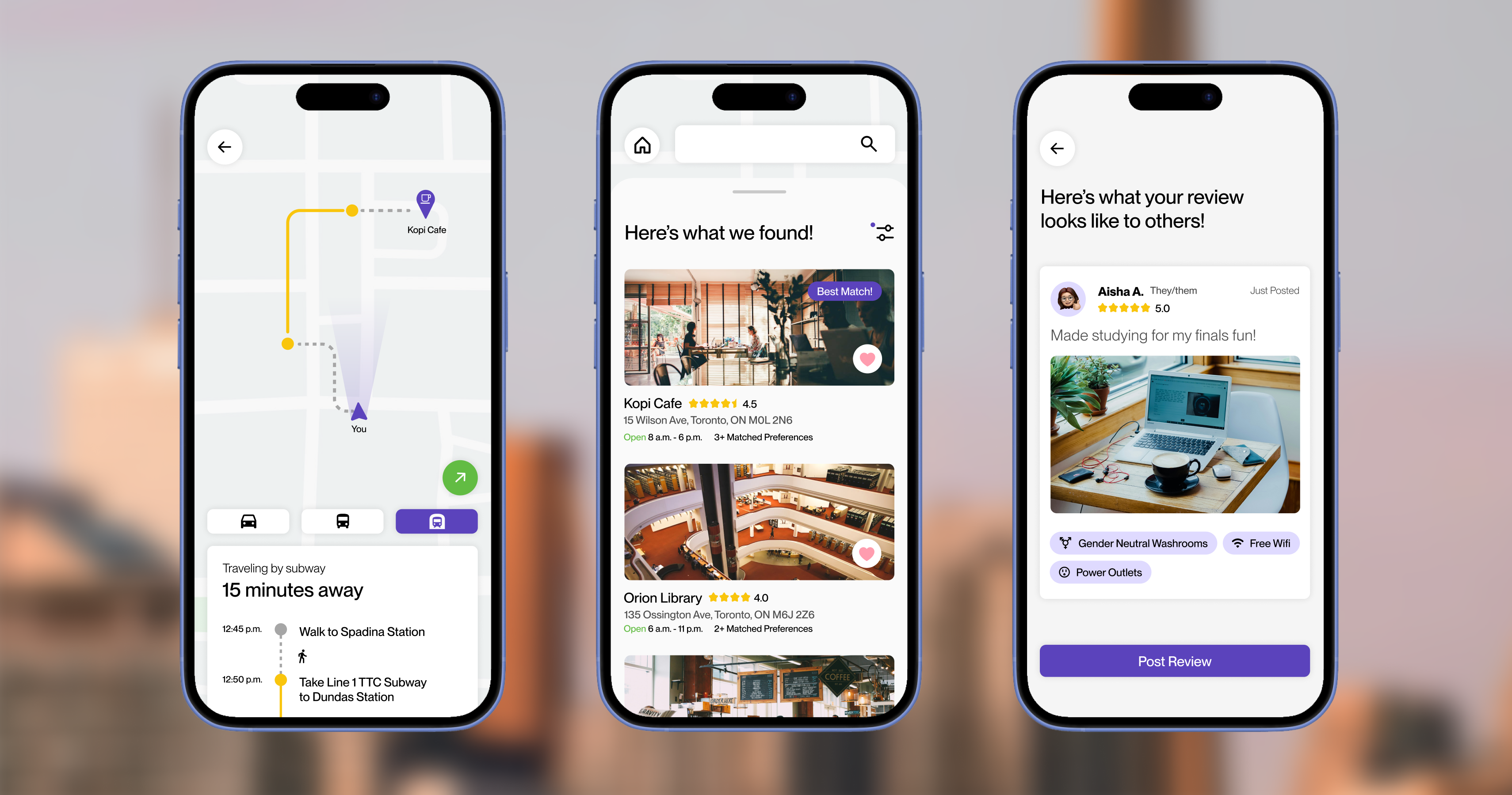
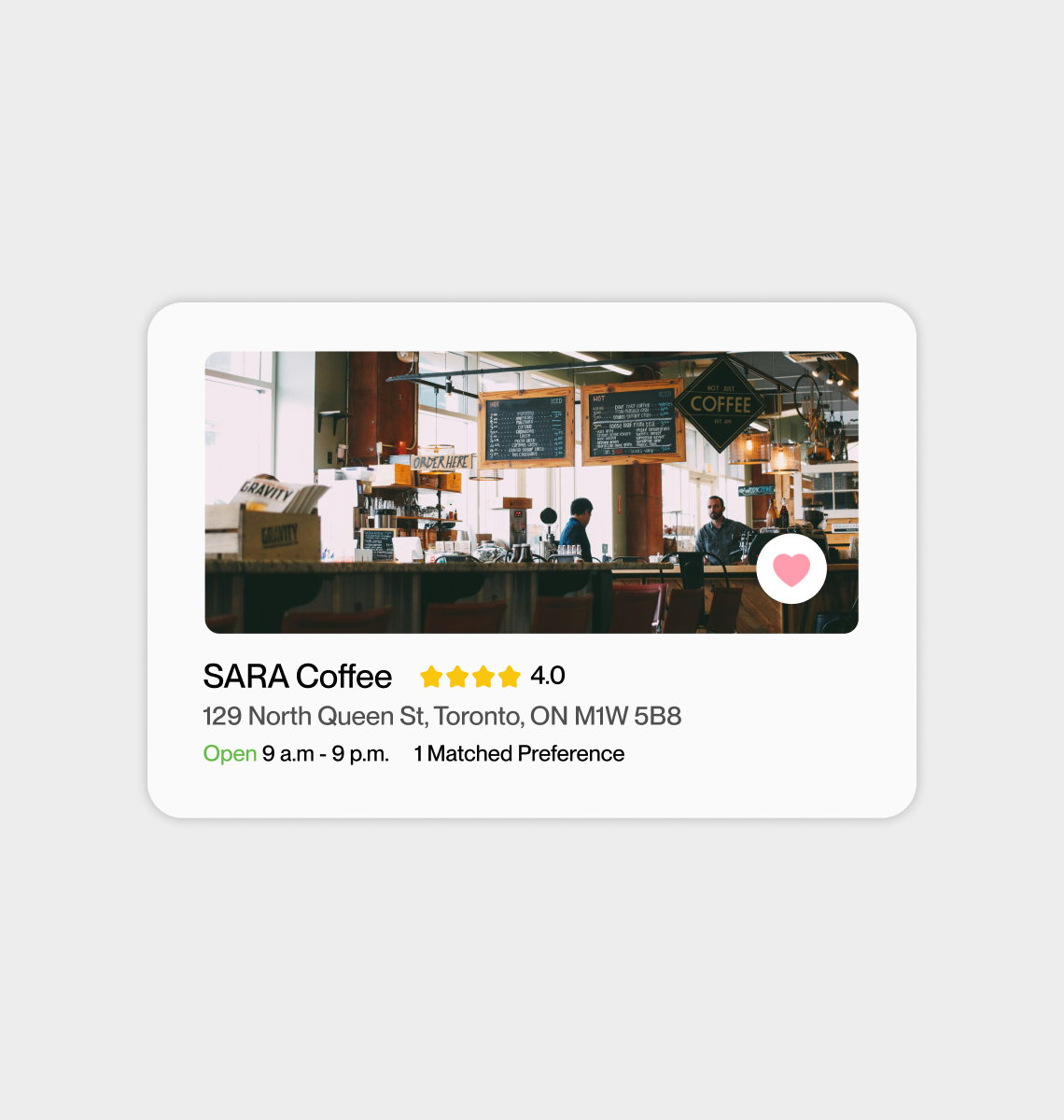
3RD is designed to help users find study spaces outside of home and school environments.
Research & Insights
After conducting 4 user interviews with post-secondary students within the Greater Toronto Area, 3 valuable insights emerged from research findings.

Based on our insights, a user persona and empathy map was crafted to further investigate their needs and pain points. The journey map provides a scenario where Aisha explores a new study space.


Selecting Task Flows
Informed by our user research, a selection of 4 key tasks from onboarding to saving a study space were created to advance our design process.

Low & mid-fidelity wireframes were formed according to each unique task flow before the finalizing design and prototyping stage.


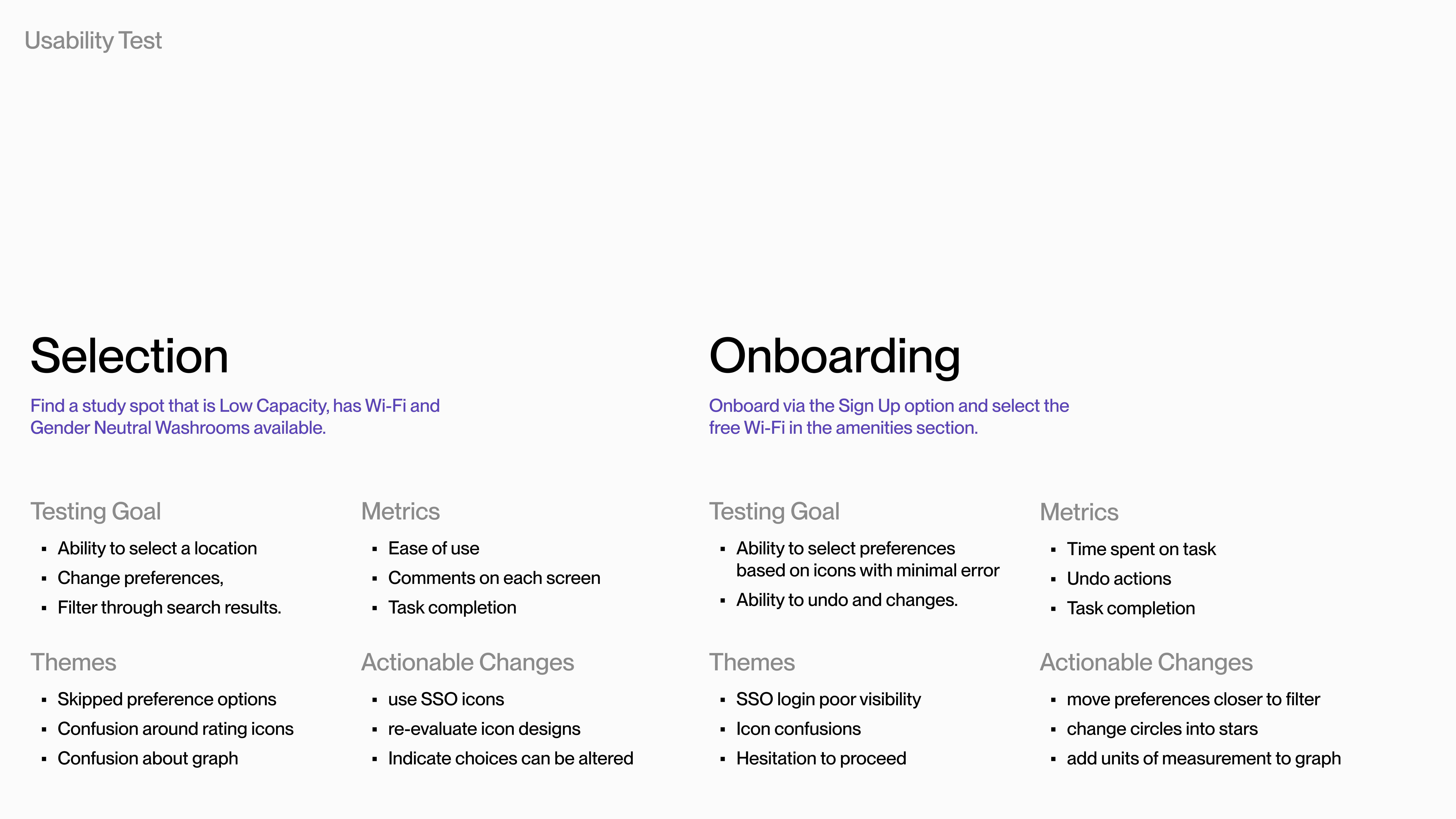
Usability Testing
We were able to identify themes and actionable changes across our testing sessions with 6 participants. Consequently, adjustments were made to improve the app's ease of use.
Takeaways
From designing a zero-to-one product, I learned that the constant refinement of our research gave us a headstart on 3RD's intent and target audience. In addition, our usability test sessions quickly resolved existing and potential pain points that may go unnoticed without a collaborative setting.

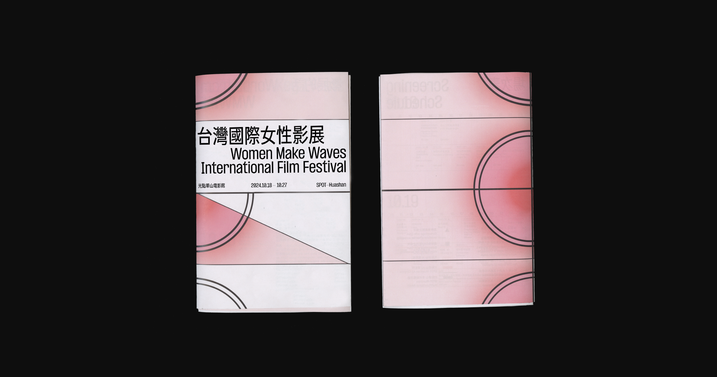
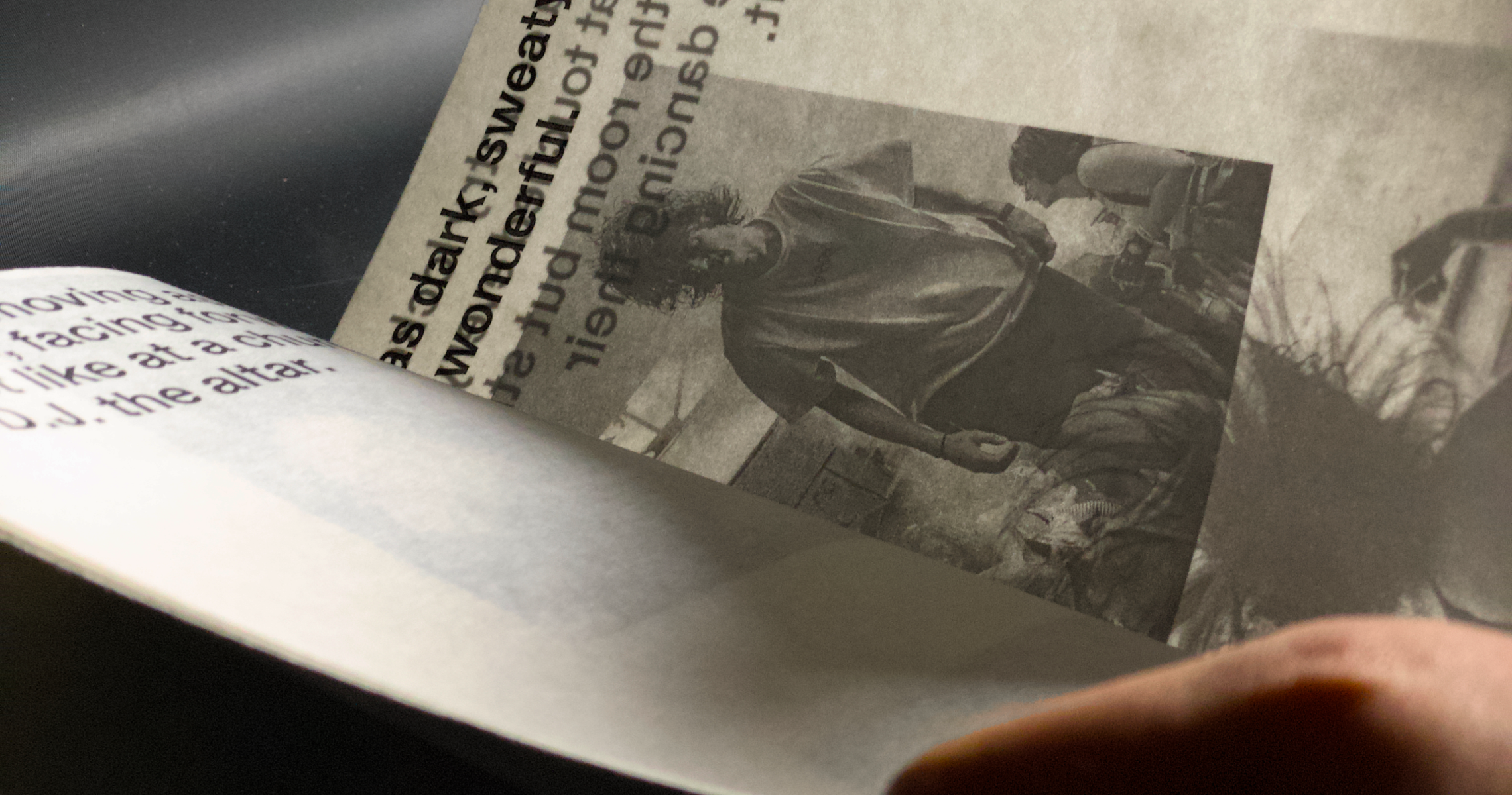
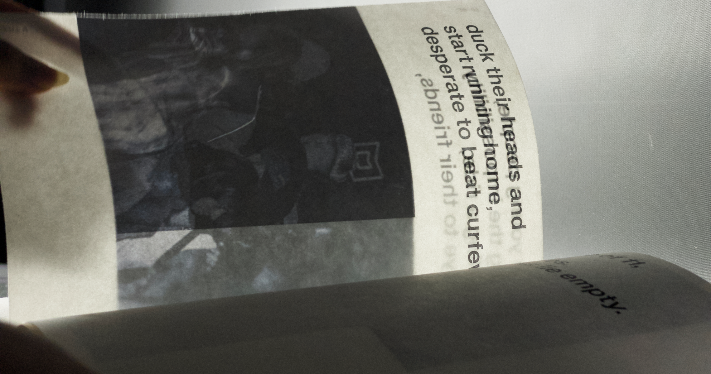
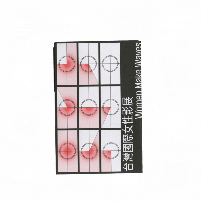
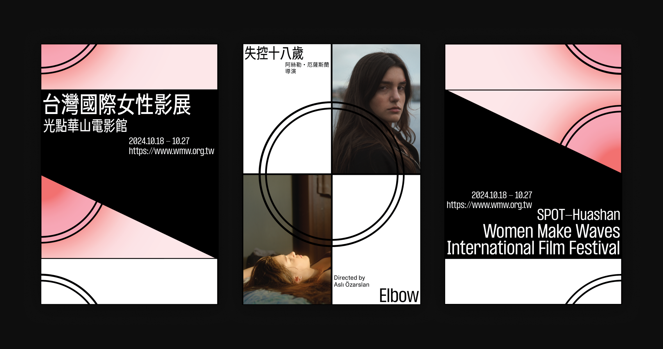
Building upon the festival’s visual identity, the program provides participants information on interactive workshops, screening schedules, and directions around the venue. The folding technique is a specialized accordion fold that allows all pages to be held and viewed as spreads without the need for binding techniques.


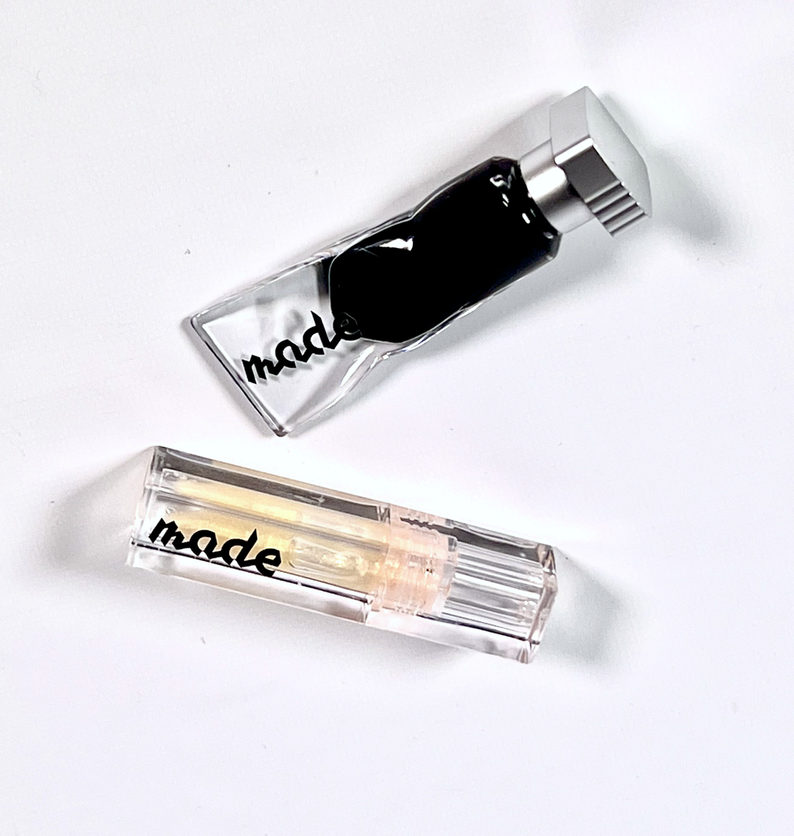
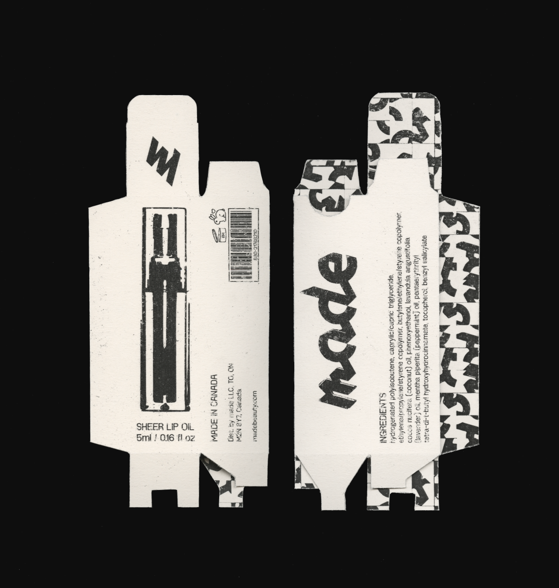
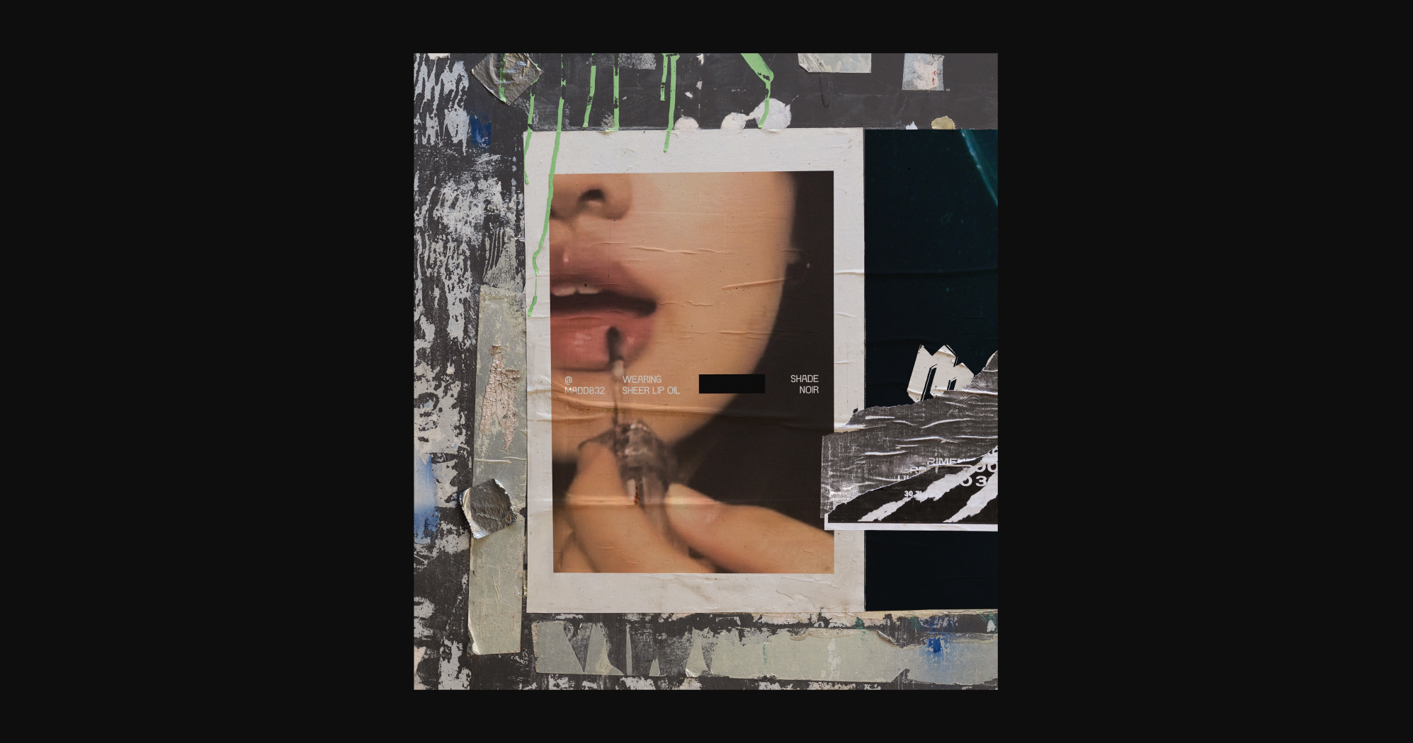
The Made primary logo draws inspiration from the continuous, textured swatches and strokes created while applying makeup. Furthermore, the pattern uses fragmentation, turning the “made” wordmark into an abstract geometric form.
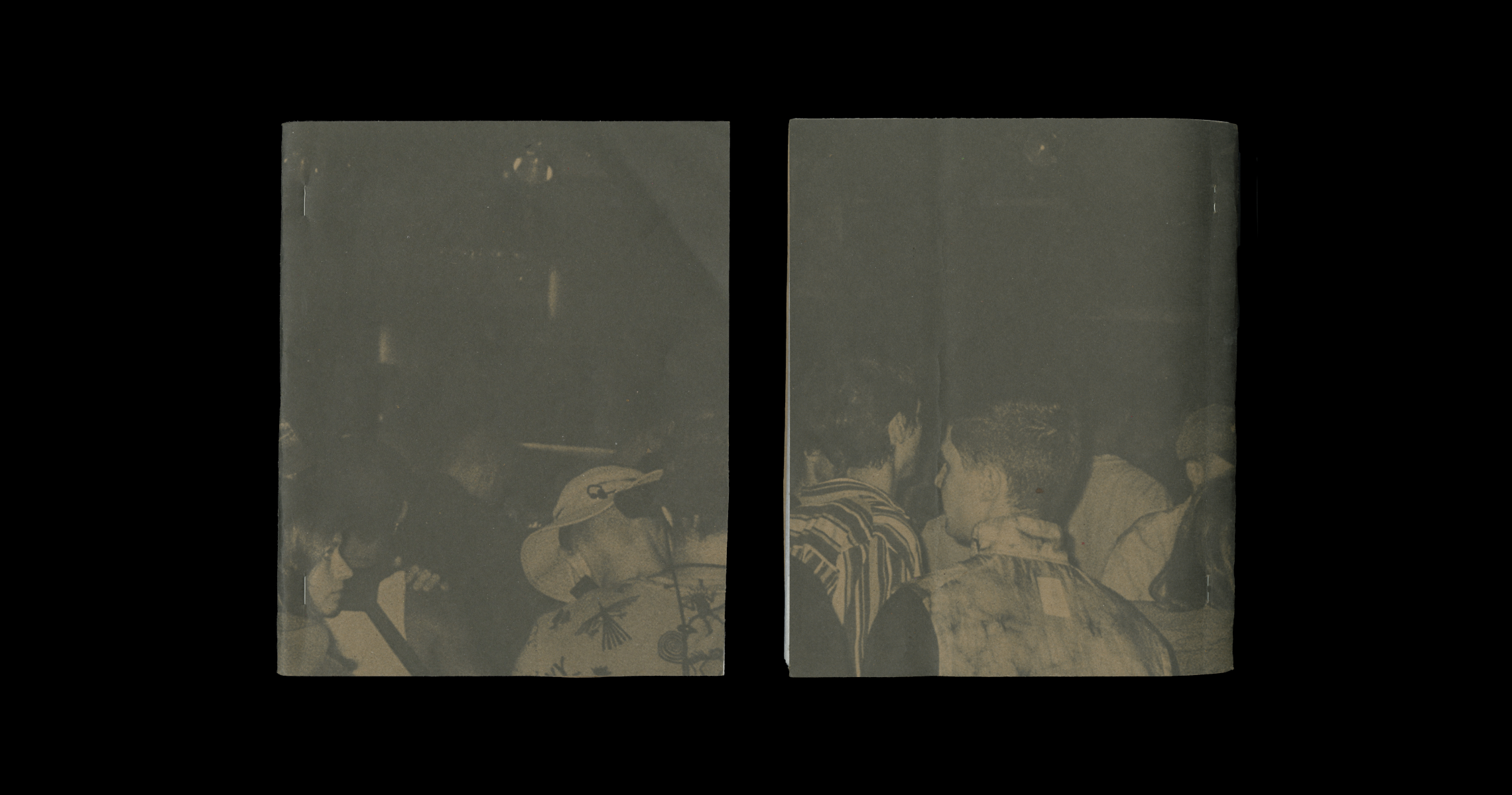
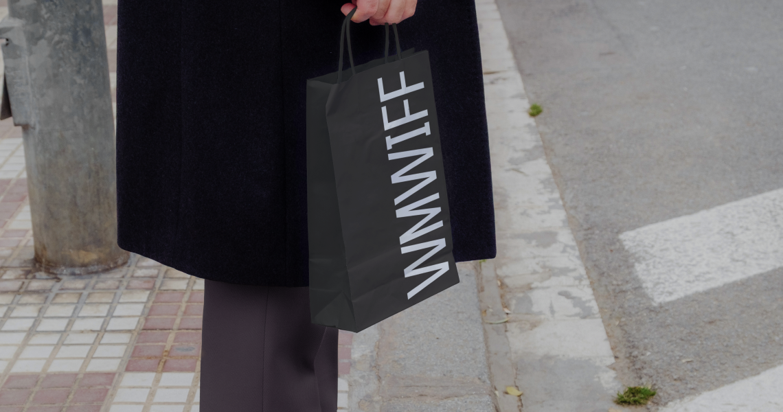
A festival kit containing a folder, program, tickets, and passes are distributed among special guests and members of the press as a special souvenir. The press kit folder doubles as a mini poster of the festival when unfolded.


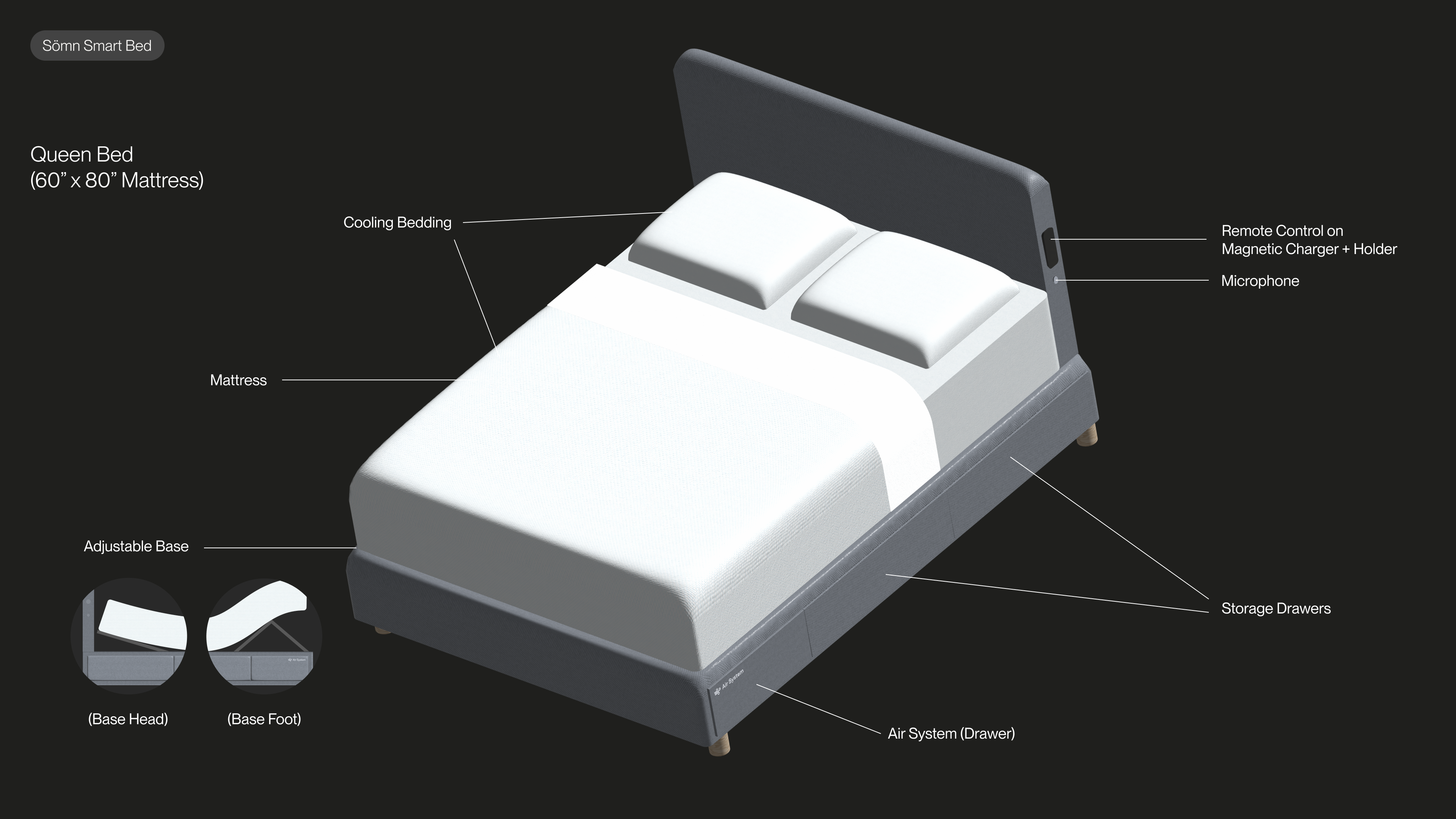
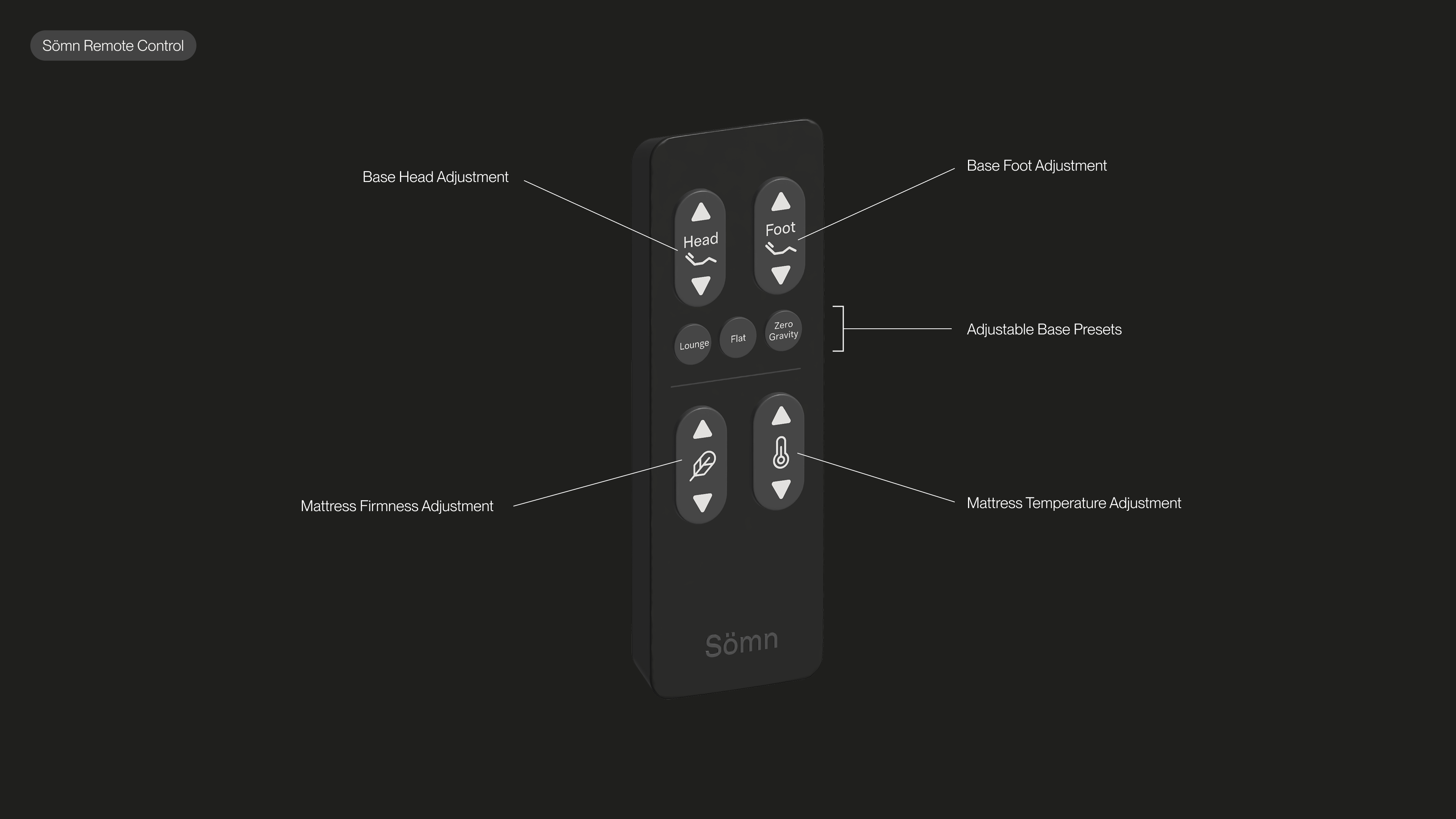
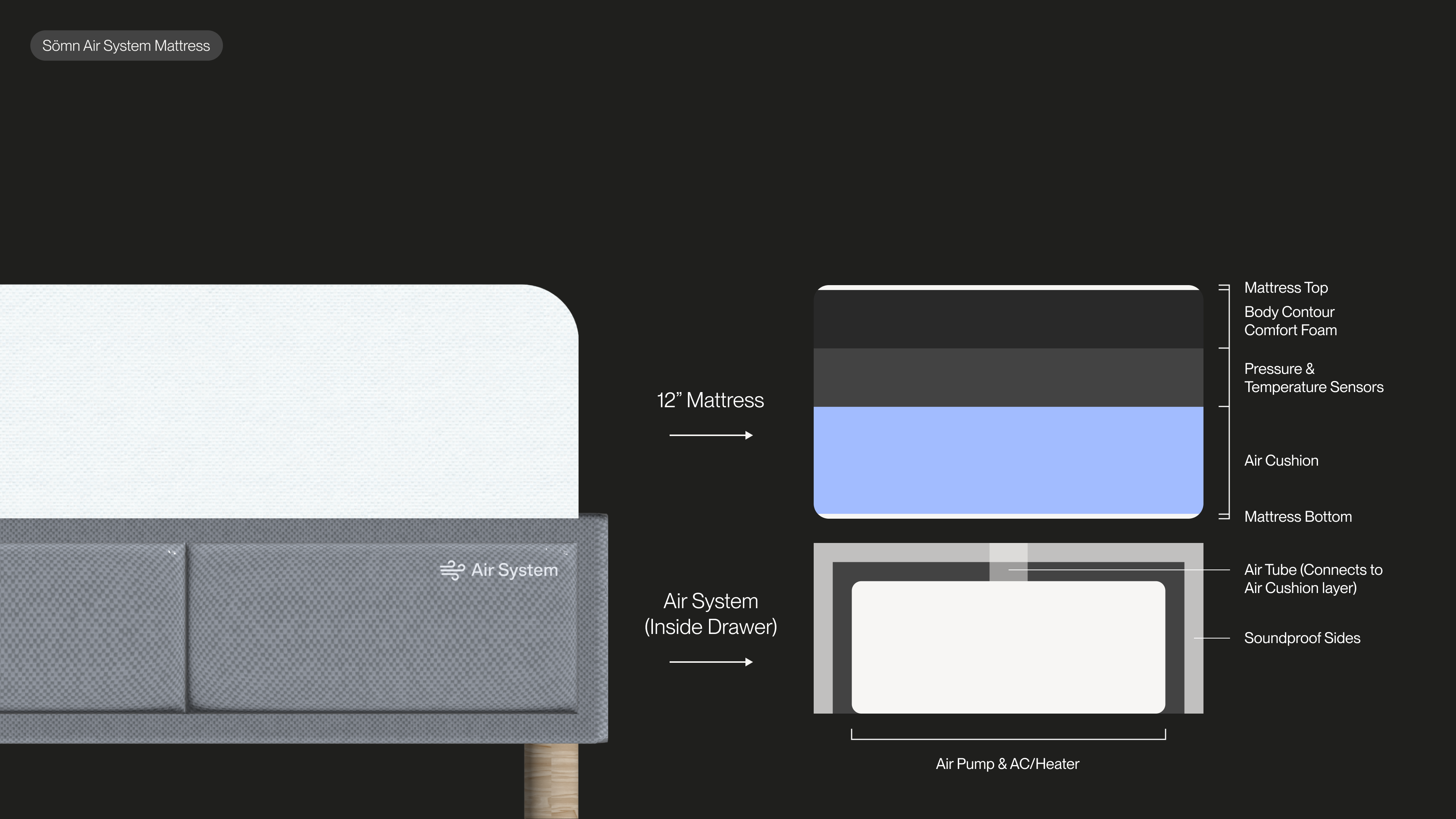
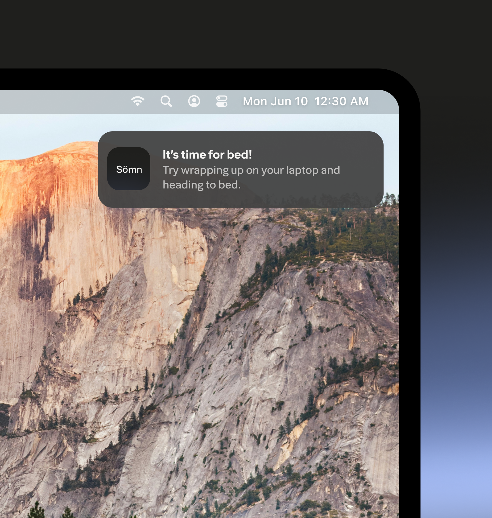
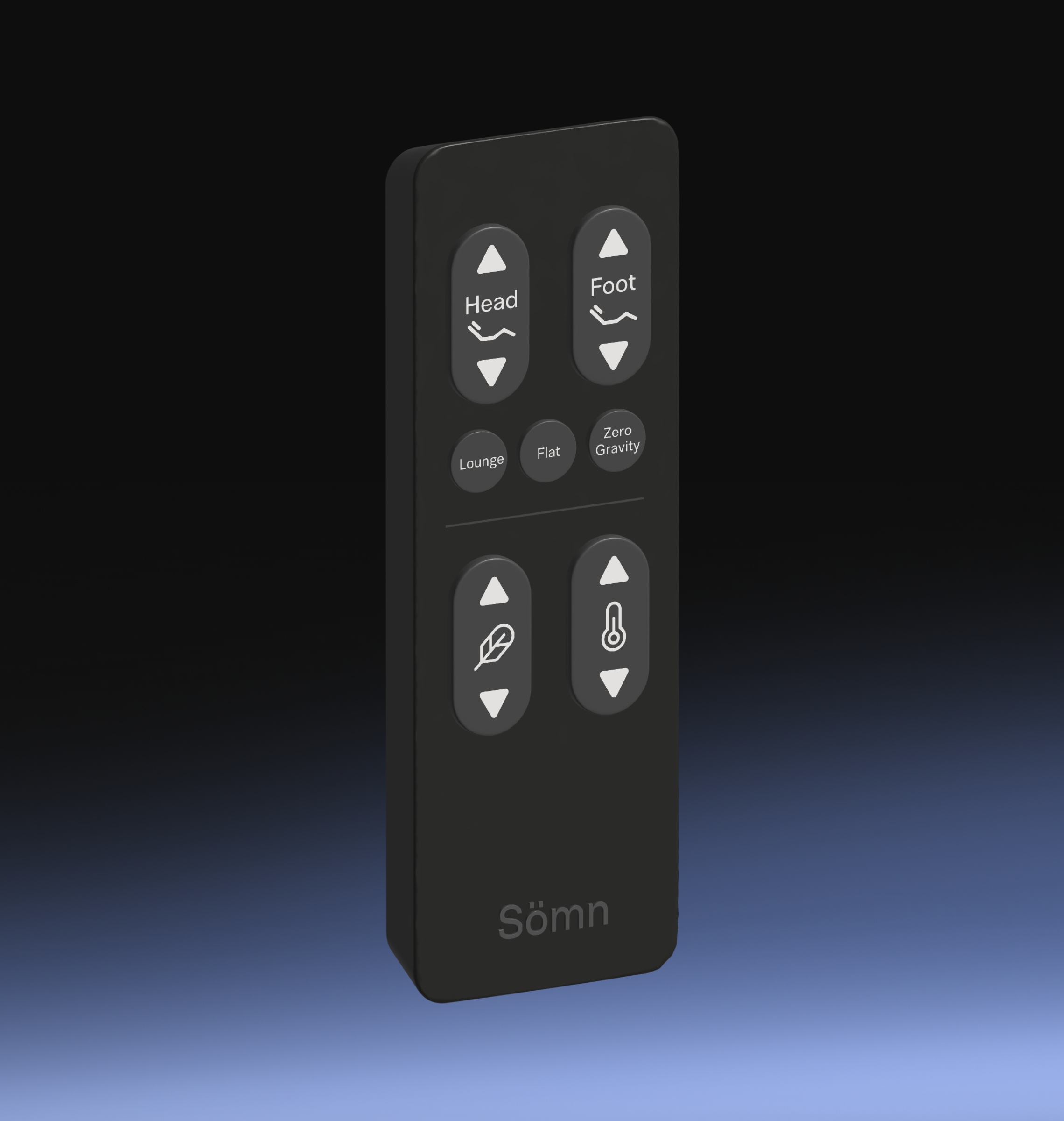
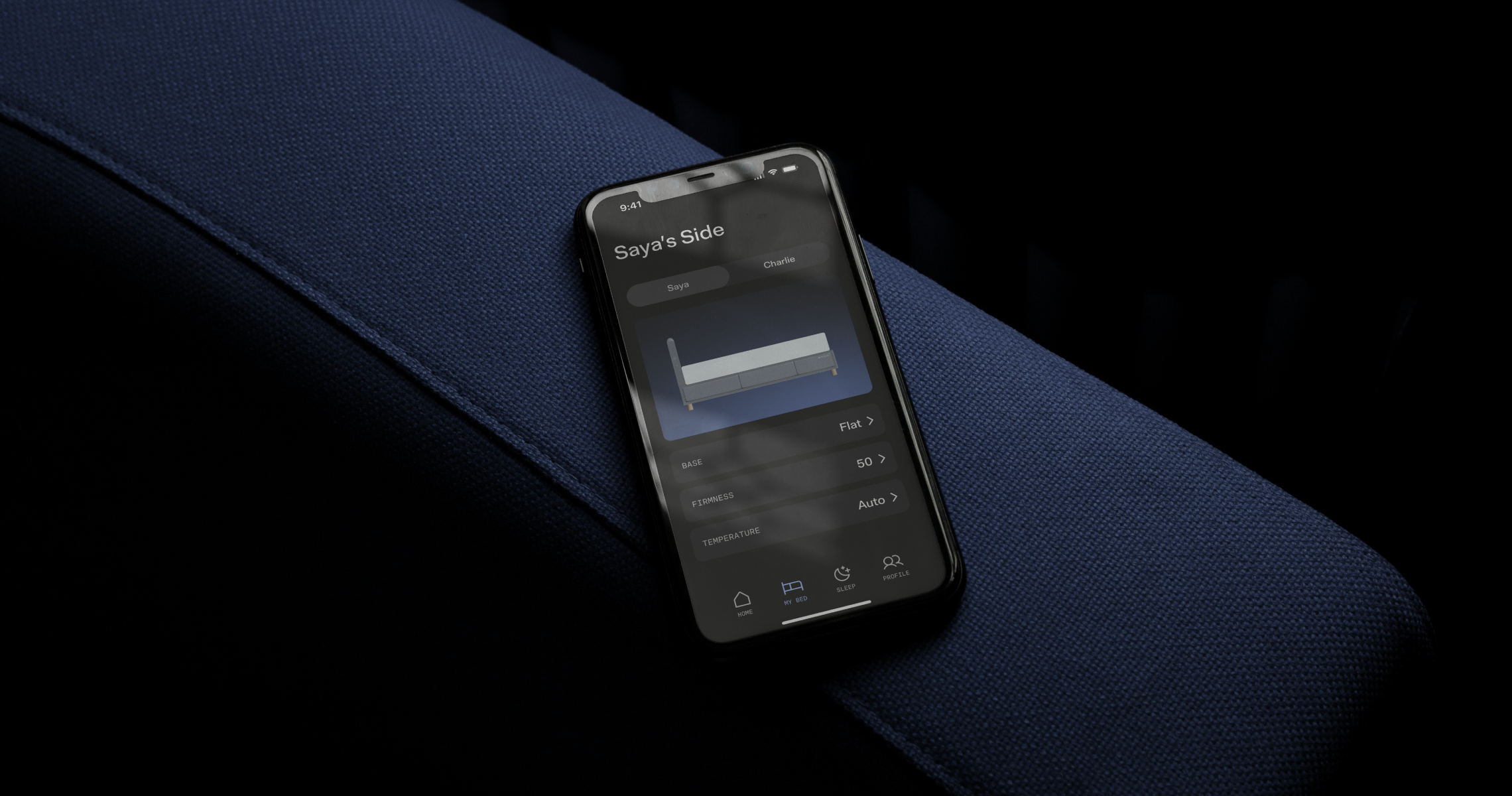
Introducing Sömn, an AI-powered smart bed designed to empower your well-being & sleep all night long.
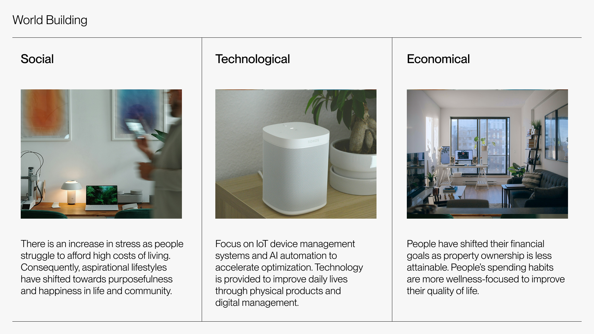
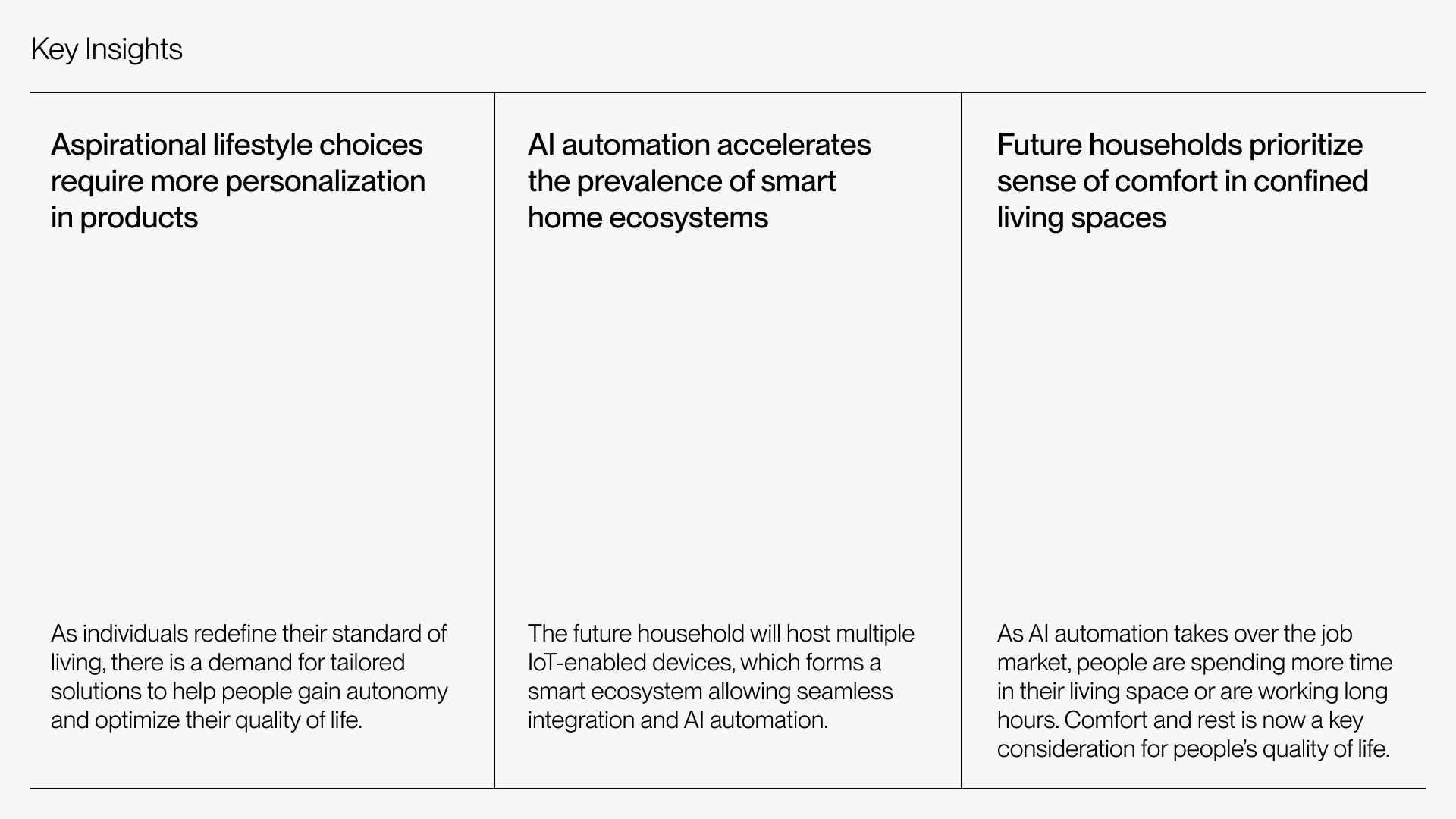
World Building for 2040
Using the S.T.E.E.P framework and trend analysis, I conducted research into current and anticipated social, technological, and economical trends. In the future of 2040, 3 key insights emerged from my findings.
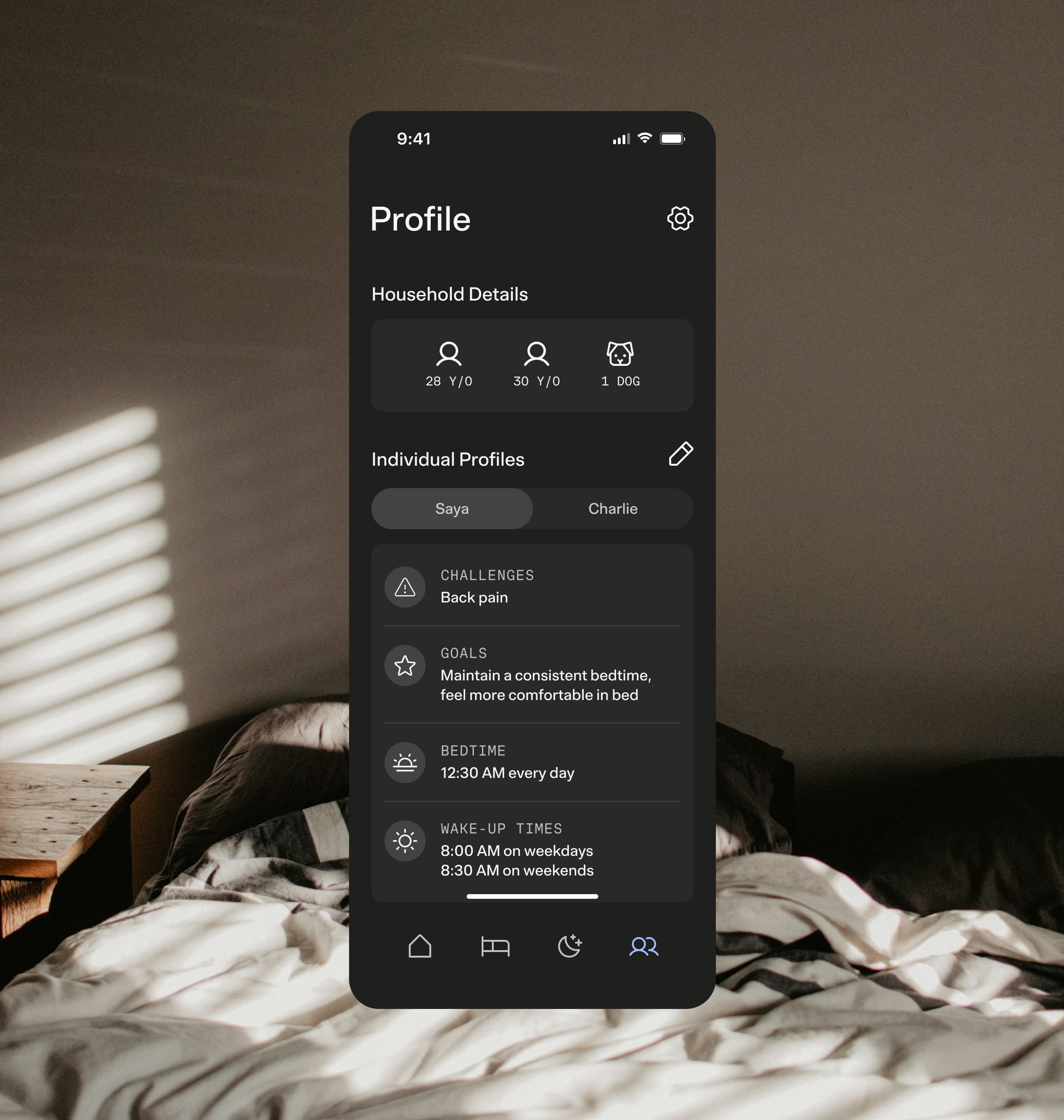
The Sömn Smart Bed offers AI-powered insights and personalized customizations according to individual needs, even when the product is shared with other users.
Takeaways
This future scenario based project prompted me to focus on adaptability and emerging trends of smart home technologies. Through the combination of physical and digital design, Sömn will be a compatible product for many in the foreseeable future.